
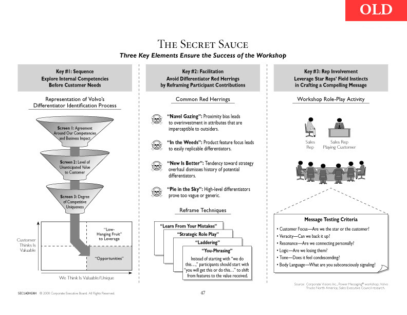
As part of CEB’s rebranding process, the design department was tasked with reworking the templates used for presenting research (in published studies, webinars, meetings, and more). Above, a typical page in the old style.
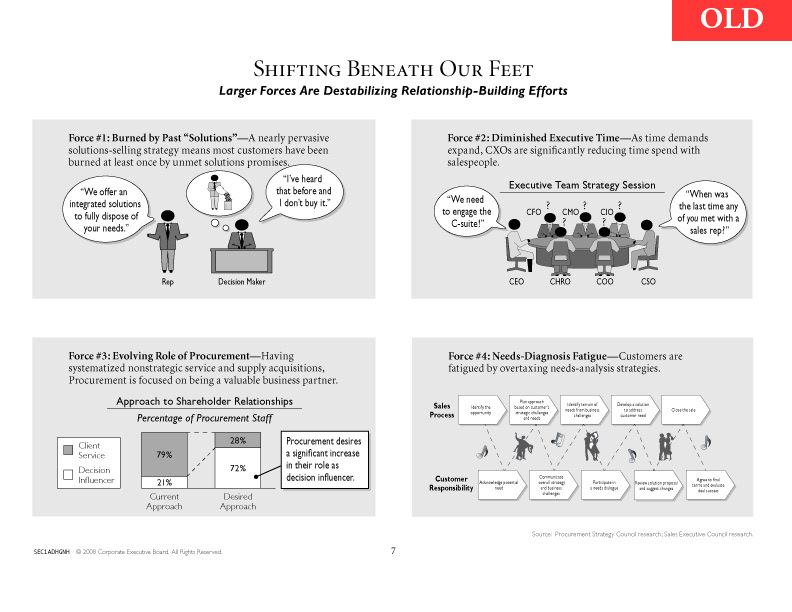
Remarkably, everything on the page used a set paragraph style or was built from a standard library of images. I was part of the team that had maintained and updated these templates, and which was subsequently tasked with completely redesigning the pages when the company underwent a rebranding effort. Our update appears in the following images.
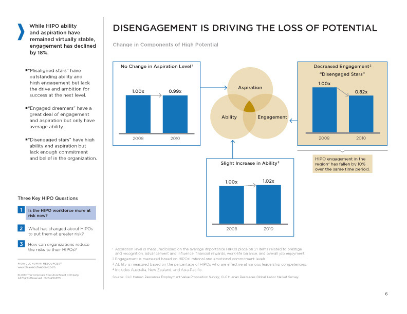
I was part of a small team of designers who rethought the typical page layout, created new paragraph/object/table styles, and led classes for the other designers as well as the company’s researchers, to adjust to the new style. One of my largest contributions was being solely responsible for the redesign of all the company’s graphs, a major part of our research, which had to be colorized, but also needed a complete rethink in terms of size, typography, and clarity.

Above, another example of the new template. Graphics are cleaner and are used only to illustrate a complex idea, and never to break up an uninteresting block of text. Pages are simpler and the main point begins the page at the upper left, easing comprehension.