
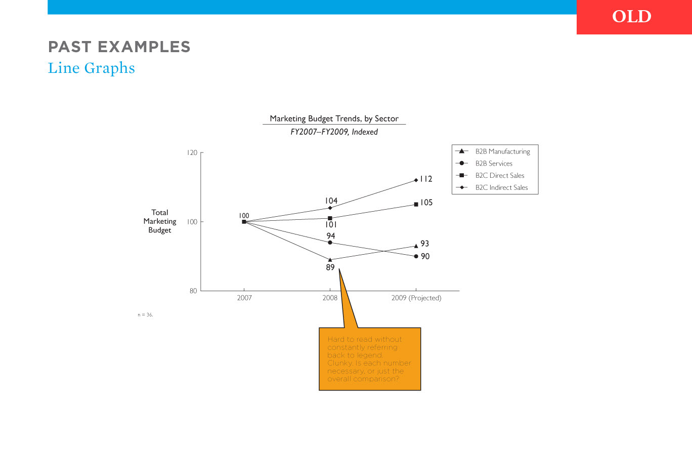
In 2009, Corporate Executive Board underwent a branding change, and I was tasked with bringing our graphs and charts up to the new, more colorful standard. This page is part of a presentation I gave to senior staff. Shown is an example of our old line graph style — clunky, cluttered, and colorless.
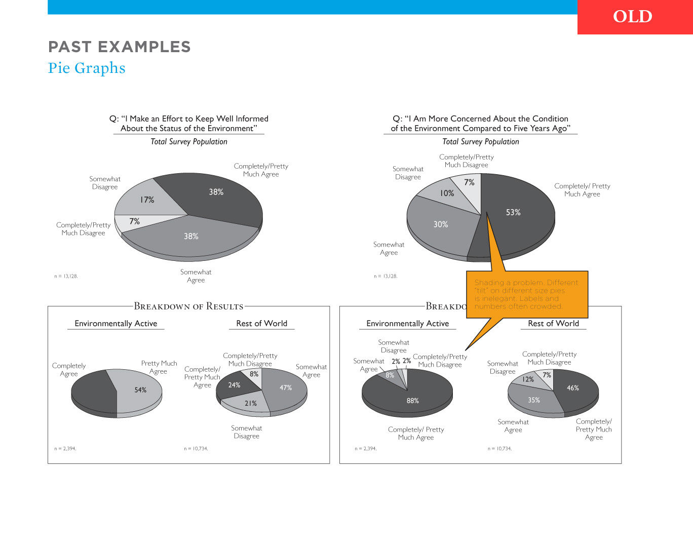
Another page from the same presentation, showing an old version of a typical page full of pie graphs. This style was cluttered visually, and the 3-D effect of the pies not only took up more room on the page but also made visually comparing percentages difficult.
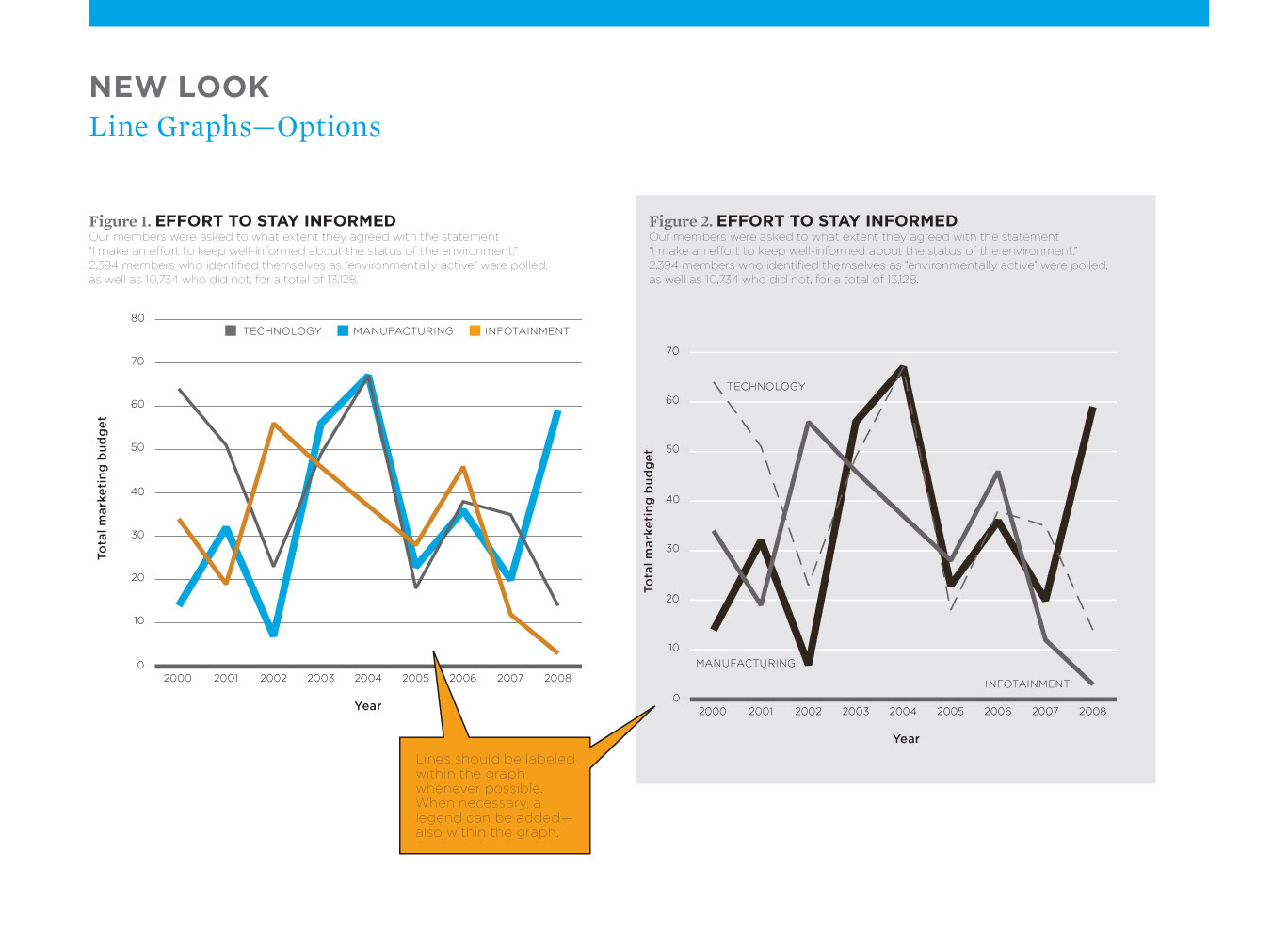
Revised versions of line graphs in both the new corporate colors and grayscale. In keeping with our simpler, less cluttered style, graphs would need to be rethought to emphasize one or two key points, rather than giving everything equal weight. Everything here was built as a template — colors, styles, exact sizes — so that designers could enter new data in our software, quickly select a graph type, and have an on-brand graph ready to go.
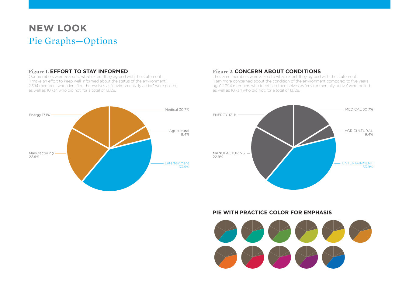
Revised versions of pie graphs. Here, too, the preference was to emphasize a key point, making these graphs much more easily and quickly absorbed.